Show code for vector creation
set.seed(123) # Setting seed for reproducibility

data <- rnorm(100, mean = 50, sd = 10) # Generating a normally distributed datasetPreviously, we noted that multivariate analysis makes certain assumptions about the data being used.
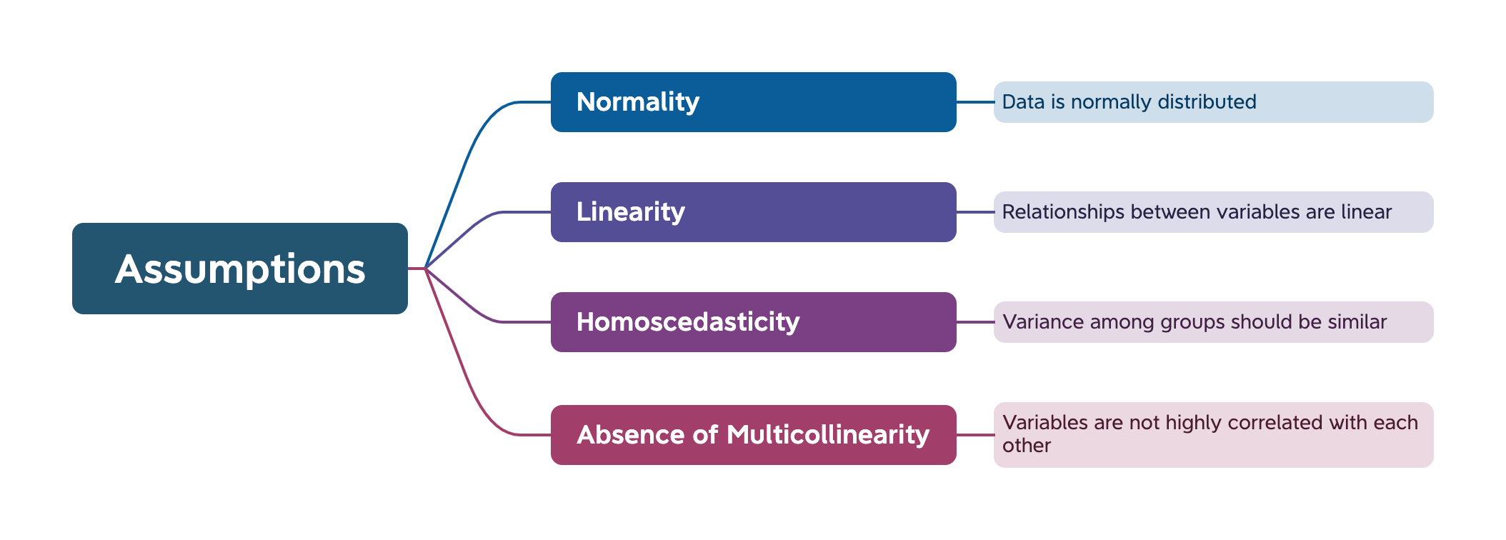
In this practical, we will learn how to check that these assumptions are being met, and what to do if they are not.
We do not have time to cover all aspects of this topic in detail. It will be useful to you to engage with some of the techniques mentioned below in greater detail in your private study.
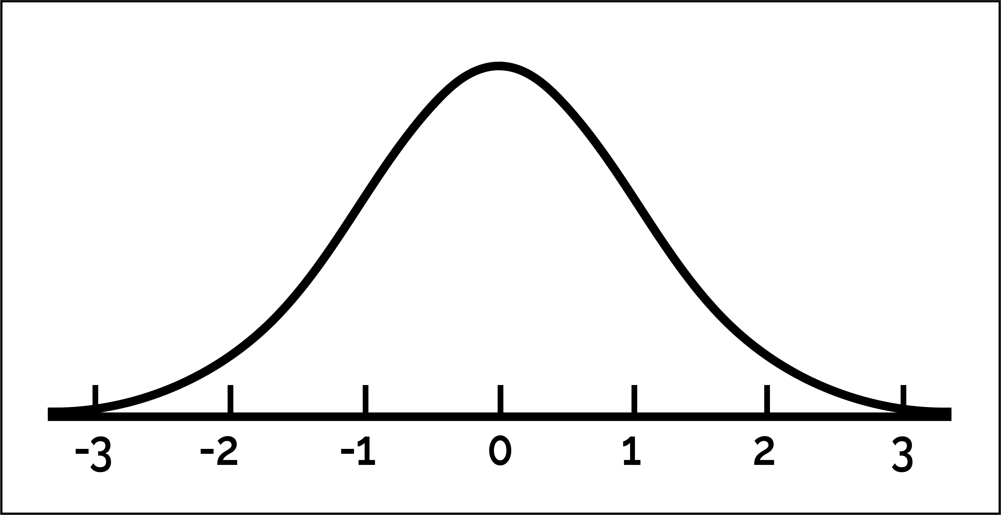
An assumption of normality suggests that the data should follow a normal distribution. There should not be an obvious positive or negative skew in the data.
Here’s a perfectly normal distribution:
In this walk-through, I’ll demonstrate how to test data for normality and what you can do to address situations where normality is not present.
First, I’m going to create a vector called data that is normally-distributed:
set.seed(123) # Setting seed for reproducibility
data <- rnorm(100, mean = 50, sd = 10) # Generating a normally distributed datasetAs always, a good starting point is to visually inspect the data.
Histograms and Q-Q plots are useful for this.
hist(data, main = "Histogram of Data Showing Normal Distribution", xlab = "Data values", border = "blue", col = "green")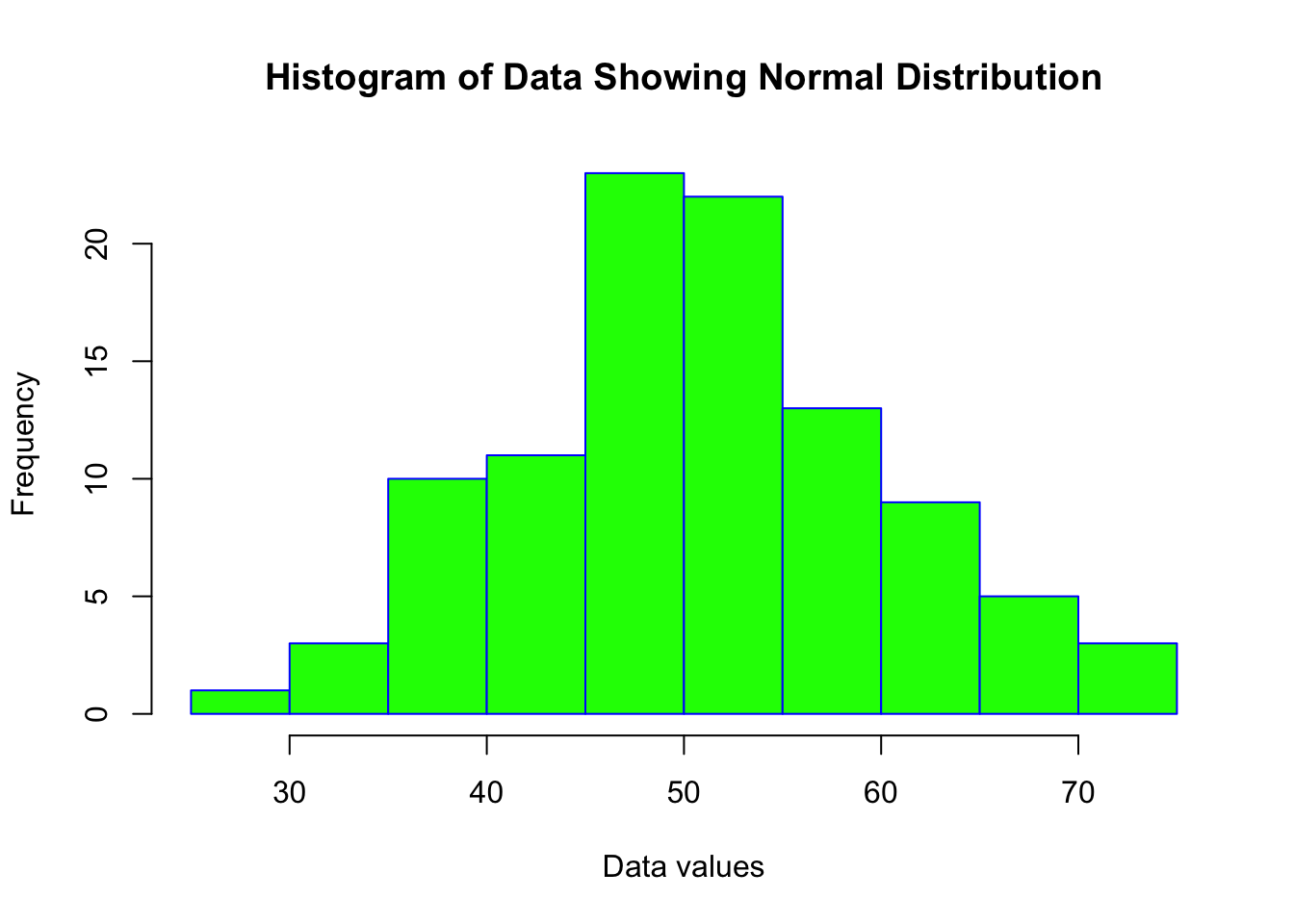
qqnorm(data)
qqline(data, col = "red")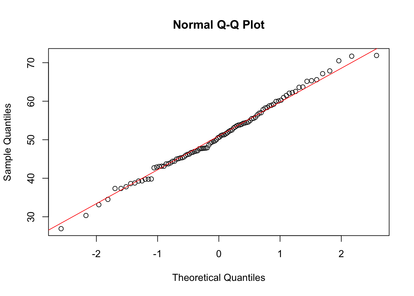
The histogram shows an almost perfect ‘normal’ distribution. The Q-Q plot similarly shows a pattern that would indicate a normal distribution of data.
A Q-Q (quantile-quantile) plot is a graphical tool used in statistics to compare two probability distributions by plotting their quantiles against each other. If you have a set of data and you want to check whether it follows a certain distribution (like a normal distribution), a Q-Q plot can help you do this visually.
In a Q-Q plot, the quantiles of your data set are plotted on one axis, and the quantiles of the theoretical distribution are plotted on the other axis. If your data follows the theoretical distribution, the points on the Q-Q plot will roughly lie on a straight line.
For example, if you’re checking for normality, you would plot the quantiles of your data against the quantiles of a standard normal distribution. If the plot is roughly a straight line, it suggests that your data is normally distributed. Deviations from the line indicate departures from the theoretical distribution.
While visual inspection is useful, statistical tests offer a more reliable way of determining the normality of data distribution.
Two tests are commonly used to check for normality in data, the Shapiro-Wilk test and the Kolmogorov-Smirnov test.
Shapiro-Wilk Test
shapiro.test(data)
    Shapiro-Wilk normality test

data:  data
W = 0.99388, p-value = 0.9349
A p-value greater than 0.05 typically suggests that the data does not significantly deviate from normality. In this case, p > 0.05 and therefore we can assume our data is normally distributed.
Kolmogorov-Smirnov Test
ks.test(data, "pnorm", mean = mean(data), sd = sd(data))
    Asymptotic one-sample Kolmogorov-Smirnov test

data:  data
D = 0.058097, p-value = 0.8884
alternative hypothesis: two-sided
Like the Shapiro-Wilk test, p > 0.05 suggests normal distribution.
Now let’s create a synthetic vector that is not normally distributed.
# Set seed for reproducibility
set.seed(123)

# Generate a normally distributed vector
normal_data <- rnorm(1000, mean = 12, sd = 2)

# Apply an exponential transformation to create negative skew
# Since the exponential function is rapidly increasing, it stretches the right tail more than the left tail
neg_skew_data <- exp(-normal_data)
We’ll visually inspect the vector using a histogram and a Q-Q plot:
# Histogram

hist(neg_skew_data, main = "Histogram of Data", xlab = "Data", border = "blue", col = "green")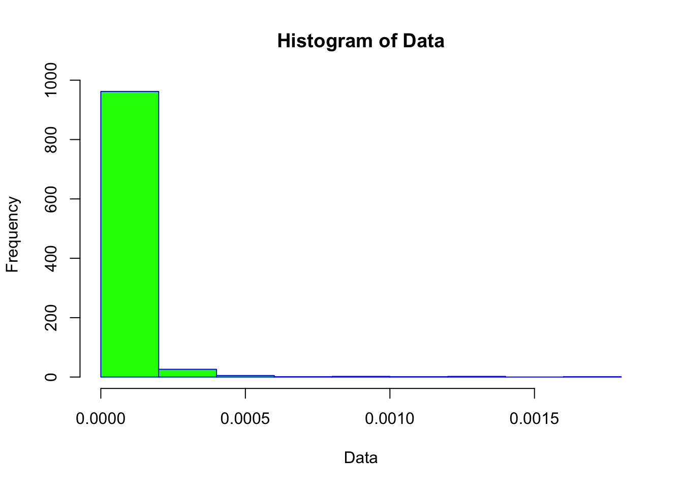
# Q-Q Plot

qqnorm(neg_skew_data)
qqline(neg_skew_data, col = "red")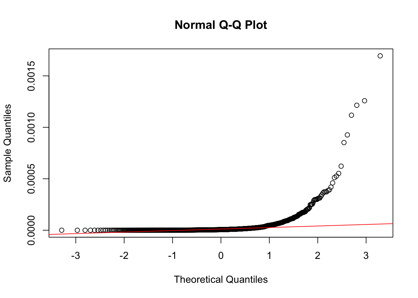
Notice how different these plots are compared to the normally-distributed data we used earlier.
The statistical tests also confirm that the vector is non-normal (in both cases, the p-value is < 0.05).
shapiro.test(neg_skew_data)
    Shapiro-Wilk normality test

data:  neg_skew_data
W = 0.30347, p-value < 2.2e-16ks.test(data, "pnorm", mean = mean(neg_skew_data), sd = sd(neg_skew_data))
    Asymptotic one-sample Kolmogorov-Smirnov test

data:  data
D = 1, p-value < 2.2e-16
alternative hypothesis: two-sidedAs with missing data and outliers, we try to address issues in the data rather than simply deleting it, or avoiding analysis.
If our data isn’t normally distributed, we have several options:
Transformation
Common transformations include log, square root, and inverse transformations.
This is an example of log transformation:
log_data <- log(neg_skew_data)
# Now test log_data for normality as before

hist(log_data, main = "Histogram of log-transformed Data", xlab = "Data", border = "blue", col = "red")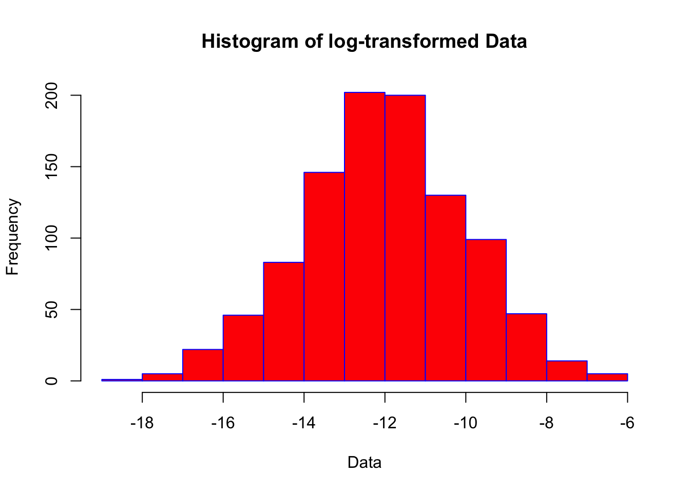
shapiro.test(log_data)
    Shapiro-Wilk normality test

data:  log_data
W = 0.99838, p-value = 0.4765
This brings us closer to a normal distribution, but statistically we still cannot be confident the data is normally distrubuted. Other techniques, which we will not cover in this tutorial, include:
Non-Parametric Tests (statistical tests which do not assume normality).
Bootstrapping - a resampling technique that can be used to estimate the distribution of a statistic.
Binning - grouping data into bins and analysing the binned data can sometimes help.
If we can’t be confident of a normal distribution, we need to look at alternative approaches to statistical analysis that do not make that assumption. These are called ‘non-parametric’ tests (e.g., Mann-Whitney U Test, Chi-Square, Kruskal-Wallis Test etc.).
The second assumption for regression is that the relationship between variables should be linear.
That is, it should be reasonable to assume that variables rise or fall at a consistent pace.
For this session, we’ll continue with the mtcars dataset in R.
data(mtcars)
df <- mtcarsScatter plot
A scatter plot can help us to visually inspect the relationship between two variables. This gives us a ‘sense’ of the association between two variables.
# create scatterplot
library(ggplot2)
ggplot(df, aes(x = wt, y = mpg)) +
  geom_point() +
  geom_smooth(method = "lm", se = FALSE) +
  ggtitle("Scatter Plot with Linear Fit")
`geom_smooth()` using formula = 'y ~ x'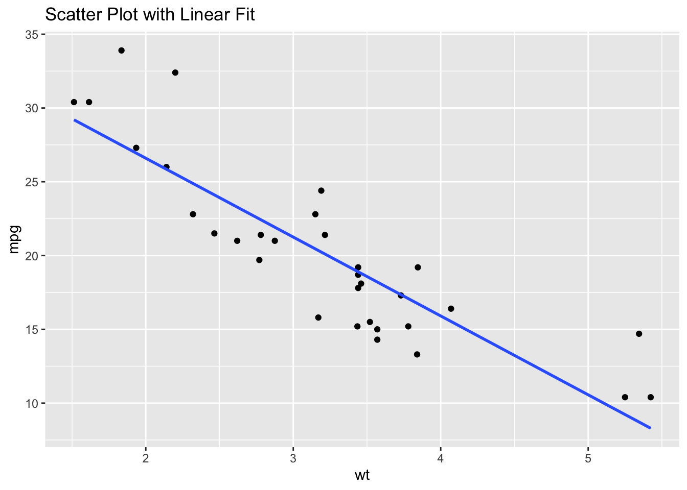
From this plot, we can conclude that there is a degree of linearity in the relationship between wt and mpg.
Residuals plot
Another way to visually check for linearity is to look at the residuals from a linear model.
# Fit a linear model
model <- lm(mpg ~ wt, data = df)

# Plot the residuals
plot(model$fitted.values, resid(model),
     xlab = "Fitted Values", ylab = "Residuals",
     main = "Residuals vs Fitted")
abline(h = 0, col = "red")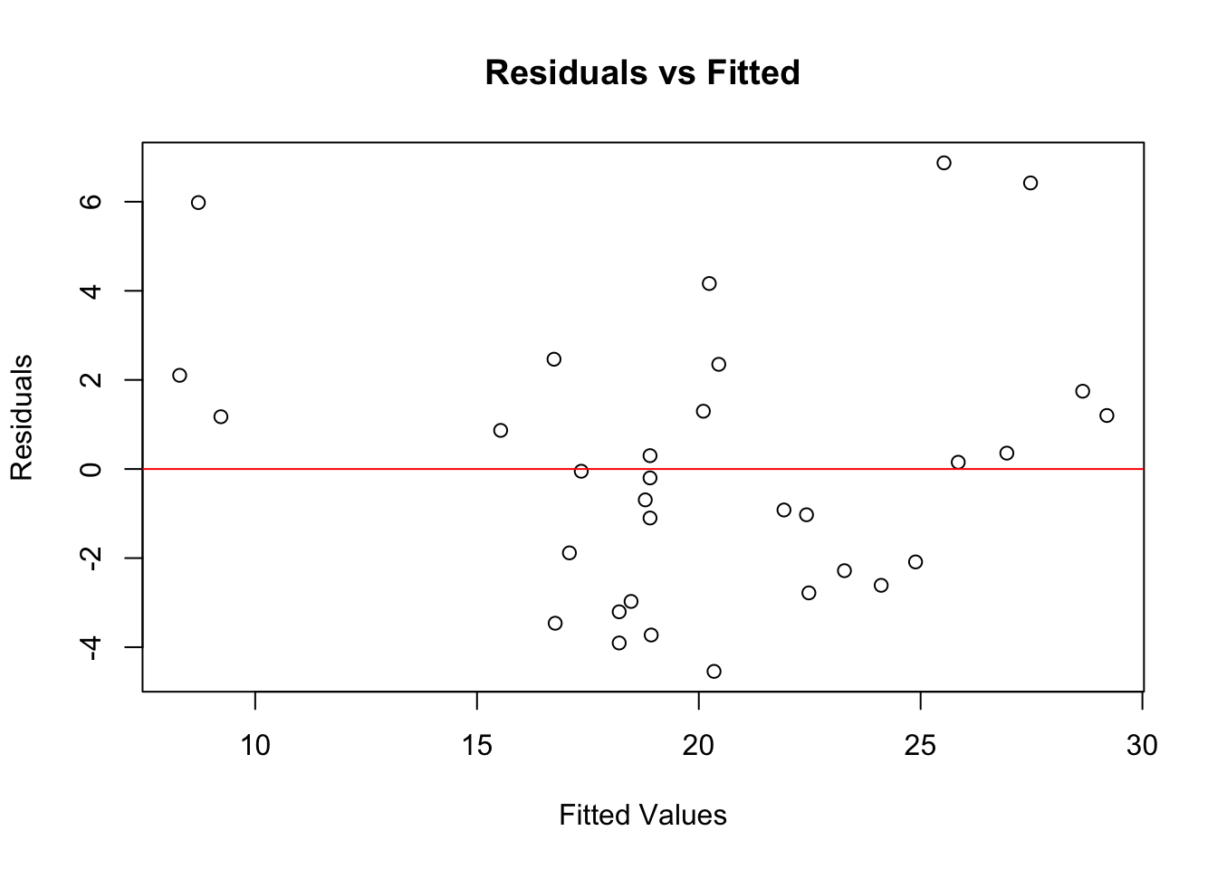
If the residuals show no clear pattern and are randomly scattered around the horizontal line, the linearity assumption is likely met. This is the case in our example here.
Now, let’s do the same thing with two variables that are not associated in a linear fashion. I’m going to deliberately create a synthetic dataset that is non-linear.
#
# This script creates two variables with quadratic, rather than a linear, relationship.

# Set seed for reproducibility
set.seed(123)

# Create a sequence of numbers for the first variable
x <- seq(-10, 10, by = 0.1)

# Generate the second variable using a non-linear transformation to produce a Quadratic Relationship
y_quadratic <- 3 + 0.5 * x^2 + rnorm(length(x), mean = 0, sd = 2)

# Combine the data into a data frame
data_quadratic <- data.frame(x = x, y = y_quadratic)# Plotting to visualise relationships
library(ggplot2)
# Plot for Quadratic Relationship
ggplot(data_quadratic, aes(x = x, y = y)) +
geom_point() +
ggtitle("Quadratic Relationship") +
theme_minimal()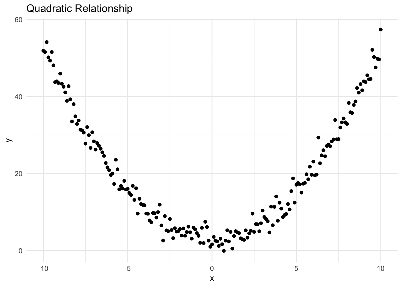
It’s clear from the plot that the relationship between the two variables is not linear (it’s quadratic).
You’ll remember that we can also plot the residuals of a regression model against fitted values: our example confirms that there is a ‘pattern’, which again suggests the relationship is not linear.
# Fit a linear model
model <- lm(x ~ y, data = data_quadratic)

# Plot the residuals
plot(model$fitted.values, resid(model),
     xlab = "Fitted Values", ylab = "Residuals",
     main = "Residuals vs Fitted")
abline(h = 0, col = "red")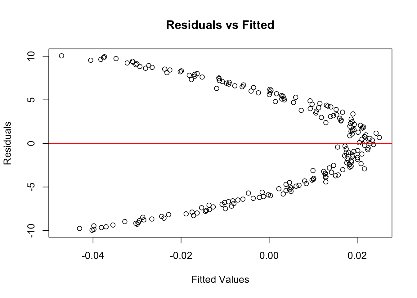
Transforming variables
If your data is not linear, you can try transforming the variables. Common transformations include log, square root, and reciprocal transformations. Be careful when trying to transform negative values.
If transformations don’t work, consider using non-linear statistical models instead of linear models (such as a polynomical regression, shown below).
# Example: Using polynomial regression
model_poly <- lm(mpg ~ poly(wt, 2), data = df)

# Check the fit
ggplot(df, aes(x = wt, y = mpg)) +
  geom_point() +
  geom_smooth(method = "lm", formula = y ~ poly(x, 2), se = FALSE) +
  ggtitle("Polynomial Regression Fit")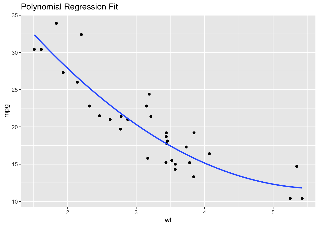
Homoscedasticity means that the variances of the residuals (the differences between the observed values and the values predicted by the model) are constant across all levels of the independent variables.
When this assumption is violated, it’s known as heteroscedasticity, which can lead to inefficient estimates and affect the validity of hypothesis tests.
For this tutorial, we’ll generate some synthetic data to illustrate homoscedasticity.
# Set seed for reproducibility
set.seed(123)

# Generate synthetic data
n <- 100
x <- rnorm(n, 50, 10)
y <- 2*x + rnorm(n, 0, 20) # This will create a bit of spread in the data

# Create a data frame
data <- data.frame(x, y)We’ll fit a linear model to this data and then check for homoscedasticity.
# Fit a linear model
model <- lm(y ~ x, data = data)There are several ways to check for homoscedasticity. As for checks of linearity, one common method is to look at a plot of residuals vs. fitted values.
# Plot residuals vs. fitted values
plot(model$fitted.values, resid(model),
     xlab = "Fitted Values", ylab = "Residuals",
     main = "Residuals vs Fitted Values")
abline(h = 0, col = "red")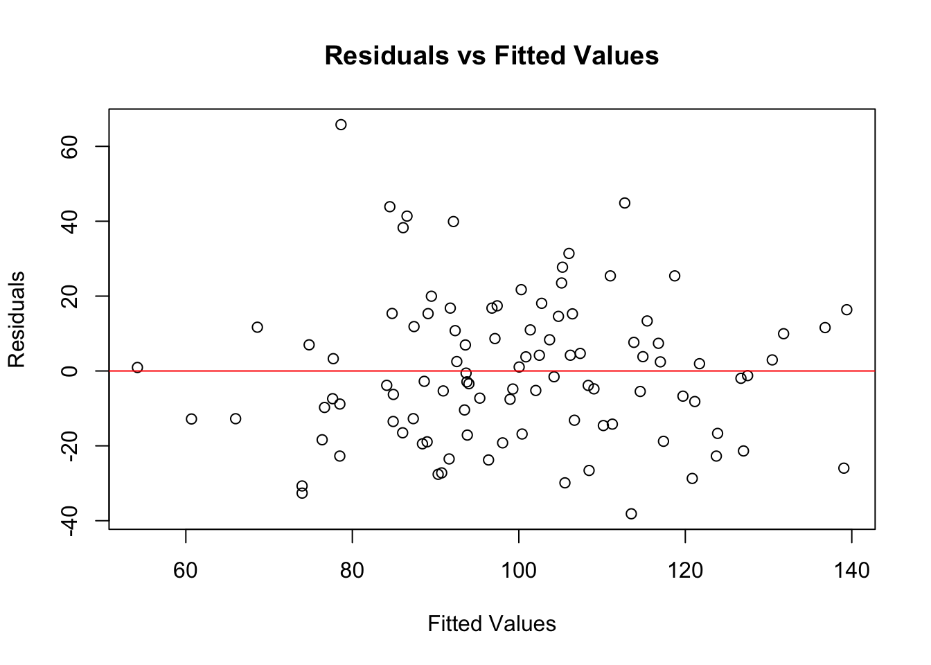
In this plot, you’re looking for a random scatter of points. If you see such a pattern, it suggests homoscedasticity.
If the residuals fan out or form a pattern, it suggests heteroscedasticity.
Besides visual inspection, you can also use diagnostic tests like the Breusch-Pagan test.
# Install and load the lmtest package
library(lmtest)
Loading required package: zoo
Attaching package: 'zoo'The following objects are masked from 'package:base':
as.Date, as.Date.numeric# Perform Breusch-Pagan test
bptest(model)
    studentized Breusch-Pagan test

data:  model
BP = 1.2665, df = 1, p-value = 0.2604
The Breusch-Pagan test provides a p-value. If this p-value is below a certain threshold (usually 0.05), it suggests the presence of heteroscedasticity. In the example above, p > 0.05, which suggests that our data is homoscedastic.
If your data is homoscedastic you can proceed with your analysis, knowing that this assumption of your linear model is met.
If you find evidence of heteroscedasticity, you might need to consider transformations of your data, or consider using different types of models that are robust to heteroscedasticity.
‘Multicollinearity’ is a problematic situation in linear regression where some of the independent variables are highly correlated. This can lead to unreliable and unstable estimates of regression coefficients, making it difficult to interpret the results.
We briefly discussed this in an earlier section.
For this section, I’ll generate some synthetic data to illustrate multicollinearity.
# Set seed for reproducibility

set.seed(123)

# Generate synthetic data

n <- 100
x1 <- rnorm(n, mean = 50, sd = 10)
x2 <- 2 * x1 + rnorm(n, mean = 0, sd = 5) # x2 is highly correlated with x1
y <- 5 + 3 * x1 - 2 * x2 + rnorm(n, mean = 0, sd = 2)

# Create a data frame

data <- data.frame(x1, x2, y)
I’ll create three scatterplots.
The first suggests that x1 and y have a linear association.
library(ggplot2)
ggplot(data, aes(x = x1, y = y)) +
  geom_point() +
  geom_smooth(method = "lm", se = FALSE) +
  ggtitle("Scatter Plot")
`geom_smooth()` using formula = 'y ~ x'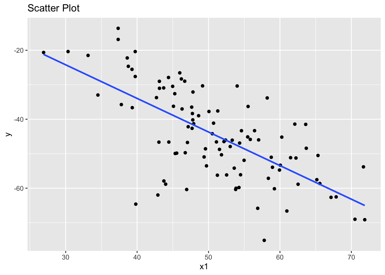
The second suggests that x2 and y also have a linear association.
library(ggplot2)
ggplot(data, aes(x = x2, y = y)) +
  geom_point() +
  geom_smooth(method = "lm", se = FALSE) +
  ggtitle("Scatter Plot")
`geom_smooth()` using formula = 'y ~ x'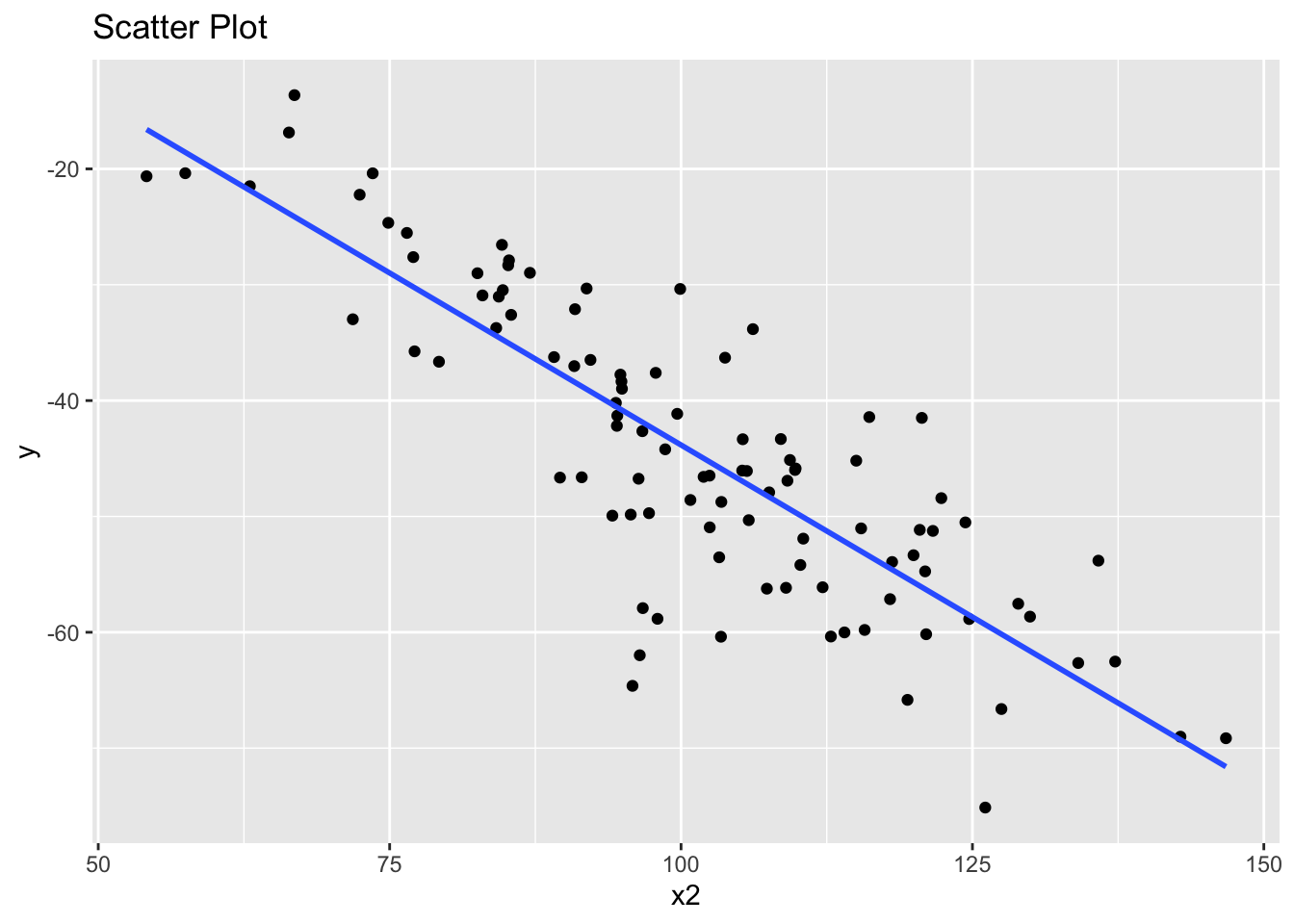
However, the problem is that our two predictor variables x1 and x2 also appear to have a linear association. This is an example of multicollinearity.
library(ggplot2)
ggplot(data, aes(x = x1, y = x2)) +
  geom_point() +
  geom_smooth(method = "lm", se = FALSE) +
  ggtitle("Scatter Plot")
`geom_smooth()` using formula = 'y ~ x'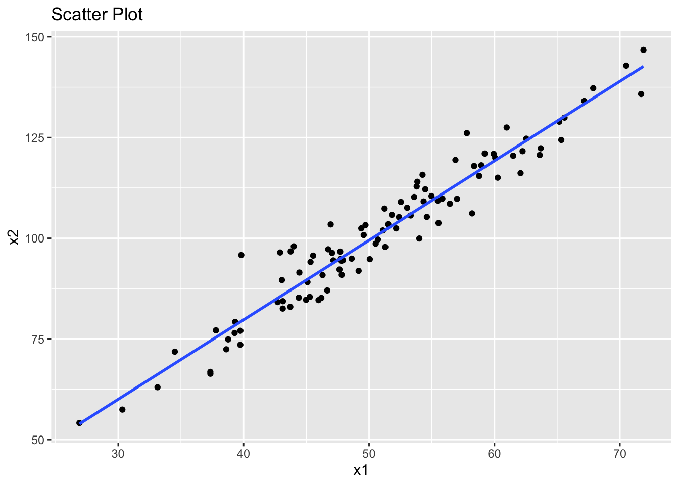
We can still fit a linear model to this data. However, we should now be concerned about the presence of multicollinearity, which makes such models unreliable.
In Step Three, we’ll cover how to use this model to check for multicollinearity.
# Fit a linear model
model <- lm(y ~ x1 + x2, data = data)A common way to check for multicollinearity is by calculating the Variance Inflation Factor (VIF).
We can do this using the regression model created in Step 2.
# load car package for VIF
library(car)
Loading required package: carData# Calculate VIF
vif_results <- vif(model)
print(vif_results) x1 x2
14.92011 14.92011 A VIF value greater than 5 or 10 indicates high multicollinearity between the independent variables. As you can see, variables x1 and x2 are highly correlated.
Therefore, if you find high VIF values, it suggests that multicollinearity is present in your model. This means that the coefficients of the model may not be reliable.
If multicollinearity is an issue, you could consider the following steps:
Remove one of the correlated variables from your analysis.
Combine the correlated variables into a single variable. If they are highly correlated, they may represent the same underlying factor.
Use Partial Least Squares Regression or Principal Component Analysis. These methods are more robust against multicollinearity.
You should download the dataset here:
dataset <- read.csv('https://www.dropbox.com/scl/fi/i6g8ww62cxm56ofppr2x2/dataset.csv?rlkey=0910fampdxazuuhynxpu1x9a3&dl=1')The dataset contains 7 variables, an identifier X and six measures (x1,x2,x3,x4 andy1,y2).
Carry out tests for the four assumptions covered above. You should be ready to report on the normality, linearity, homoscedasticity and multicollinearity within the dataset for the following:
x1, x2 and x3. Which are normally distributed, and which are not?x1 and x4?x1 or x3?y1 with x1 and x2?Solution
# Load necessary libraries
library(ggplot2)
library(car)


# Comparing distributions of x1, x2, and x3
shapiro.test(dataset$x1)
    Shapiro-Wilk normality test

data:  dataset$x1
W = 0.99388, p-value = 0.9349shapiro.test(dataset$x2)
    Shapiro-Wilk normality test

data:  dataset$x2
W = 0.97289, p-value = 0.03691shapiro.test(dataset$x3)
    Shapiro-Wilk normality test

data:  dataset$x3
W = 0.89172, p-value = 5.884e-07hist(dataset$x1, main="Histogram of x1", xlab="x1")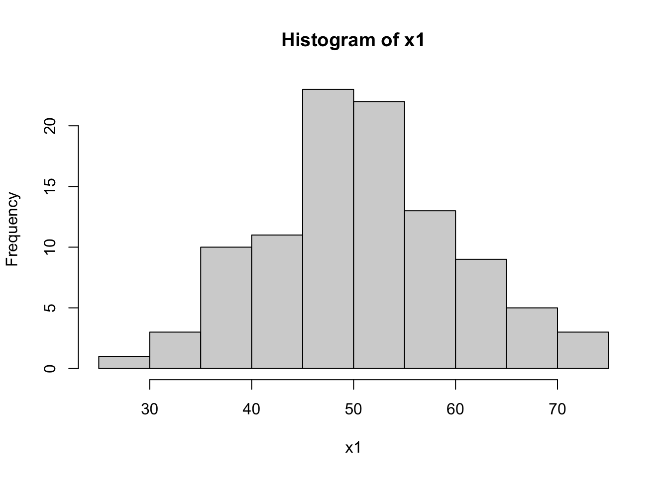
hist(dataset$x2, main="Histogram of x2", xlab="x2")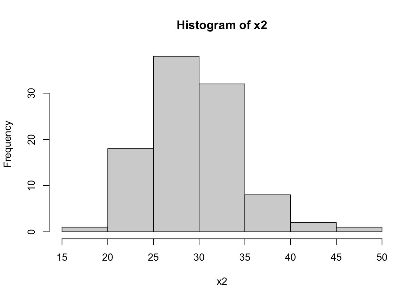
hist(dataset$x3, main="Histogram of x3", xlab="x3")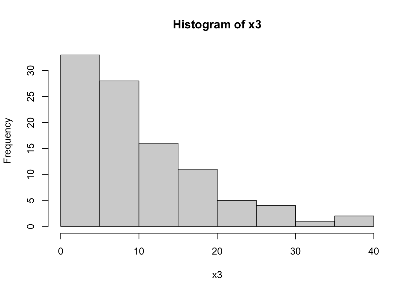
# Checking for multicollinearity between x1 and x4
vif_result <- vif(lm(y1 ~ x1 + x2 + x3 + x4, data=dataset))
vif_result
x1 x2 x3 x4
21.062343 1.005200 1.037161 21.196664 # Testing Linearity of y1 with x1 and x3
plot(dataset$x1, dataset$y1, main="Scatter plot of x1 vs y1")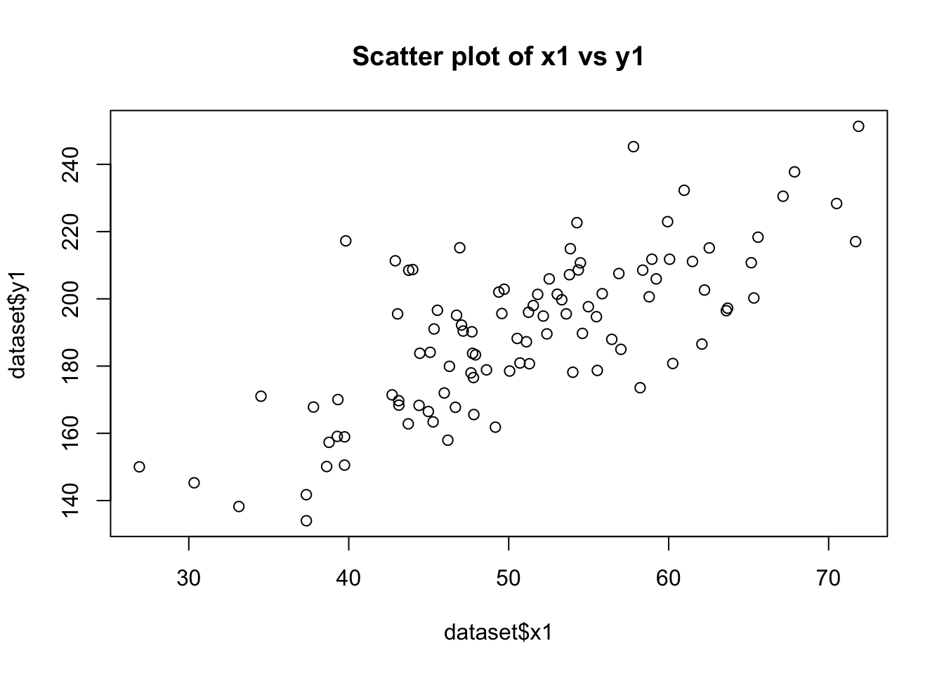
plot(dataset$x3, dataset$y1, main="Scatter plot of x3 vs y1")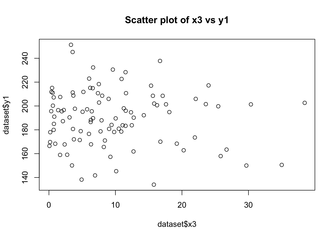
cor(dataset$x1, dataset$y1)[1] 0.7443448cor(dataset$x3, dataset$y1)[1] -0.08930172# Testing Homoscedasticity in relationship between y1 with x1 and x2
model <- lm(y1 ~ x1 + x2, data=dataset)
plot(model, which = 1)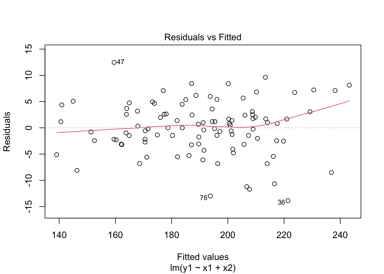
Comparing Distributions of x1, x2, and x3:
The Shapiro-Wilk tests for x1 and x2 return high p-values (typically p > 0.01), suggesting that these variables are normally distributed. In contrast, a low p-value for x3 indicates a non-normal distribution, which aligns with our expectation since x3 was generated from an exponential distribution.
The histograms will visually support these findings. x1 and x2 should show bell-shaped curves typical of normal distributions, while x3 should display a skewed distribution.
Multicollinearity between x1 and x4:
High VIF values for x1 and x4 (i.e., a VIF greater than 5 or 10) indicates the presence of multicollinearity. Given that x4 was generated to be correlated with x1, a high VIF is expected.
Linear Relationship of y1 with x1 and x3:
The scatter plots will visually indicate the nature of the relationships. A clear linear pattern in the plot of y1 vs. x1 would suggest a linear relationship, while a more scattered or non-linear pattern in y1 vs. x3 would suggest a non-linear relationship.
The correlation coefficients will provide a numerical measure of these relationships. A coefficient close to 1 or -1 for y1 vs. x1 would indicate a strong linear relationship. In contrast, a coefficient closer to 0 for y1 vs. x3 would suggest a lack of linear relationship. Homoscedasticity in the Relationship between y1 with x1 and x2:
The residual vs. fitted value plot for the linear model of y1 predicted by x1 and x2 should show a random scatter of points with no clear pattern. If the variance of residuals appears constant across the range of fitted values (no funnel shape), it suggests homoscedasticity. This means the variance of errors is consistent across all levels of the independent variables, which is an important assumption for linear regression models.